It’s election night 2020. Who do you turn to? We asked three experts for their thoughts.

I’m still scarred from 2016. With an abiding faith in polls and data visualization, I trusted, like so many other people, that Hillary Clinton was a shoo-in for the presidency.
But even the best minds got it wrong. The polling was off by greater margins than ever before. And for all the maps, meters, and calculators that seemed so easy to read, there was an unintended consequence: The news outlets failed to depict the margin of error behind polling data—a margin of error that Hillary’s seemingly epic lead was actually well within. (You can read our full breakdown of what happened here.)
So I’ve abstained as much as possible from following the latest election infographics this year. However, as we approach election night November 3—knowing full well that because of mail-in voting, we might not actually know our next president by the end of the night—I feel the itch coming back. I need to follow the election results. You need to follow the election results. Who should we be following?
It’s a question that I posed to three prominent data designers: Which publications are they referencing to stay up-to-date, and who will they be obsessively refreshing on election night? Here are their answers.
FiveThirtyEight
In 2016, many people followed FiveThirtyEight religiously, as the site’s founder, Nate Silver, made his name calling the 2008 election for Obama months early. Eric Rodenbeck, founder of the cartography-focused data viz firm Stamen, was among the site’s fans who had their hearts broken by the actual election results.
“Despite a feeling of trauma and trepidation from the last time, FiveThirtyEight is still my go-to,” says Rodenbeck. “I like that the whole map updates when you pick a state winner. It uses your input to narrow things down to just the simulations that fit your inputs. There’s a video on how to use it that’s pretty informative.”
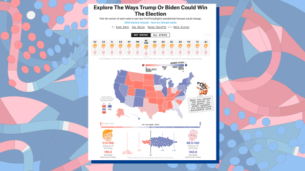
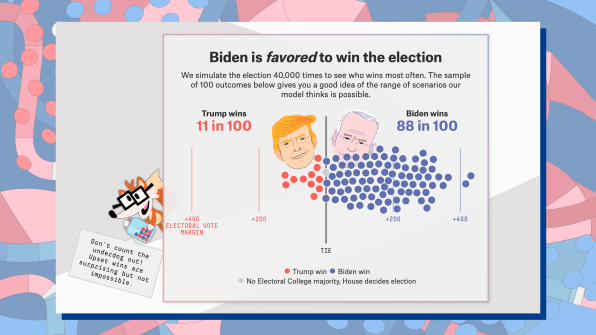
“The big change for me is that I know that wild and wacky out-of-band things happen all the time,” says Rodenbeck. “A 10% chance of a Trump win? Previously I would have thought ‘Ah, that’ll never happen, don’t worry about it.’ But if you thought there was a 10% chance of there being a catastrophic earthquake today, you’d think twice about leaving your house.”
270 to Win and ‘The Economist’
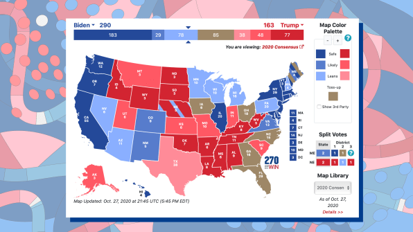
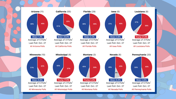
Dino Citraro, the CEO and cofounder at the “do good with data” firm Periscopic, has difficulty choosing just one go-to. He casts another top vote for FiveThirtyEight, calling it “charming, accessible, and surprisingly deep.” He goes on: “I use it when I just want a quick glance at the projections. I love the idea [that it offers interactive] simulations versus just the polls.”
‘The New York Times’
For Giorgia Lupi, a partner at the design firm Pentagram who is known for bringing a human element to data, the best data visualization of this election is not about clarity or interactivity. It’s actually about presenting information in the proper context. “I’m a visualization expert, but fundamentally, I always think about how the general public will [react] based upon the context,” says Lupi. “It’s about how people relate to the numbers they see . . . [from] the polls to what’s going on in their life.”
As a result, she prefers treatments where data visualizations are integrated into deeper stories that spell out the significance of the visualization. “I’ve particularly enjoyed the interactive stories of The New York Times, where I think they’ve been really able to make the case for a bigger poll of data, but through stories people could read and relate.”
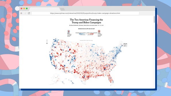
These treatments aren’t necessarily go-tos for election night (yes, Lupi refreshes FiveThirtyEight for her quick updates too), but they do lay important groundwork for this moment in time, which can easily be lost in a race to count electoral votes. And that extra context can help fill the gaps that polling inevitably misses.
“My biggest point about what I feel could have been done better around the [2016] elections is showing uncertainty, and that’s a big thing to me,” says Lupi. “There’s so much we don’t know, so many people who don’t answer a poll, so many people who might not change their mind but don’t go voting. . . . That’s a missing data point that I think needs to be treated like a data point.”
"follow" - Google News
October 29, 2020 at 06:00PM
https://ift.tt/3oyLxf7
The best sites to follow on election night, according to experts - Fast Company
"follow" - Google News
https://ift.tt/35pbZ1k
https://ift.tt/35rGyU8
Bagikan Berita Ini


0 Response to "The best sites to follow on election night, according to experts - Fast Company"
Post a Comment